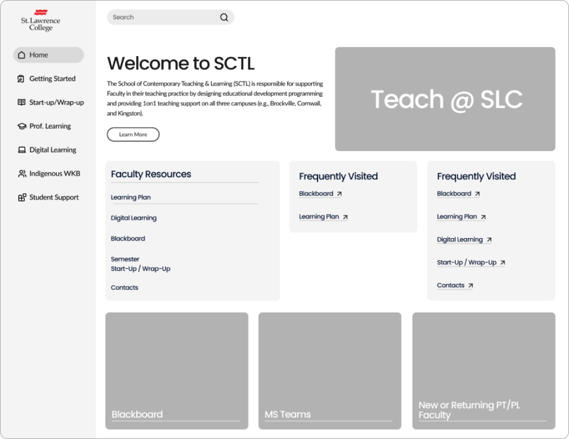
Teach@SLC

Client

The School of Contemporary Teaching and Learning (SCTL) at St. Lawrence College

Year

2024

Scope of Work

Optimize navigation, prioritize essential layout and interaction patterns, benchmark against other institutions, and improve information architecture.

UX Research + User Testing + User Interviews + Prototyping + Web Development +

UX Research + User Testing + User Interviews + Prototyping + Web Development +

Objective

Redesigning Teach@SLC to improve faculty access to educational videos and information.

Challenge

Sifting through the existing information on the website and also to understand what is the most important content for faculty members. Also with a limited understanding of faculty needs, prioritizing which content deserve prominent placement

Overview

Streamline the information on the Teach@SLC website

The School of Contemporary Teaching & Learning (SCTL) is responsible for supporting Faculty in their teaching practice by designing educational development programming and providing 1 on 1 teaching support on all three SLC campuses (Brockville, Cornwall, and Kingston).

Faculty members at SLC are having difficulty locating educational videos and information on the Teach@SLC website. This lack of efficient information retrieval is hindering faculty development and potentially impacting the quality of student learning.

Redesigning Teach@SLC to improve faculty access to educational videos comes with several challenges, especially considering the sheer volume of information and initial lack of in-depth knowledge about faculty needs.

Primary Research

“It needs better navigation, there are so many part timers that need new teacher support.”

2 staff members for our interviews

2 participants for our usability tests

For this project, we conducted primary research with Teach @ SLC staff and current platform users. We gained valuable insights from usability tests and interviews, which helped us design initial wireframes for our solution..

Our goal was to identify the main pain points that users experience when navigating the Home and Start-up / Wrap-up pages using usability tests and interviews.

These were the tasks provided for the usability tests:

Primary Research

Feedback and Comments

After each usability test, we ran a brief interview with the participants to get feedback about the Home Page. Below mentioned is the feedback that we got:

  • The content does not provide participants with useful information.

  • The use of pictures captures users attention, but they must be relevant to the content.

  • They need information quickly, not to spend time scrolling through the left-side menu.

Prototyping

Initial Wireframes

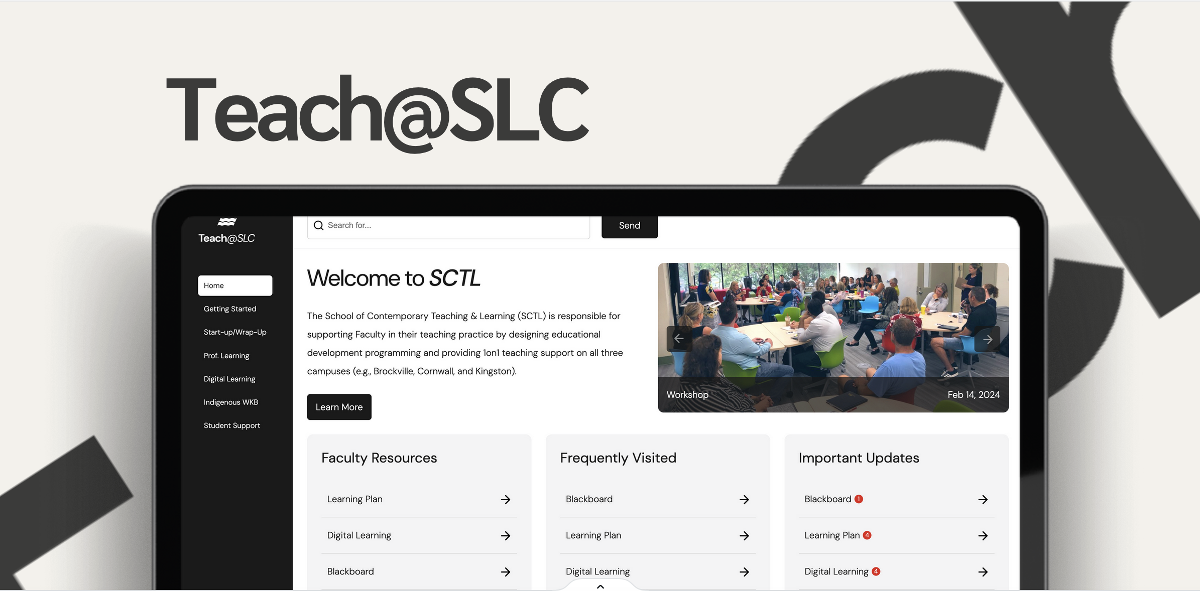
For the first iterarion we incorporated icons alongside each section menu to aid in easier recall, we also enhanced the visibility of the selected menu by highlighting it. Utilised relatable and visually appealing images within pages to alleviate content overload.

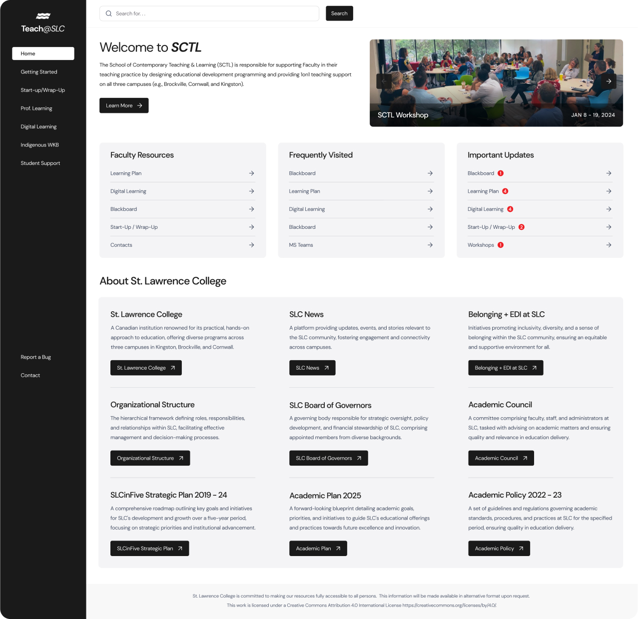
We implemented a clearer font hierarchy to facilitate smoother reading. We also defined the usage of buttons and quick links, clarifying to the user what directs them to the next page and what redirects them outside of the current page.

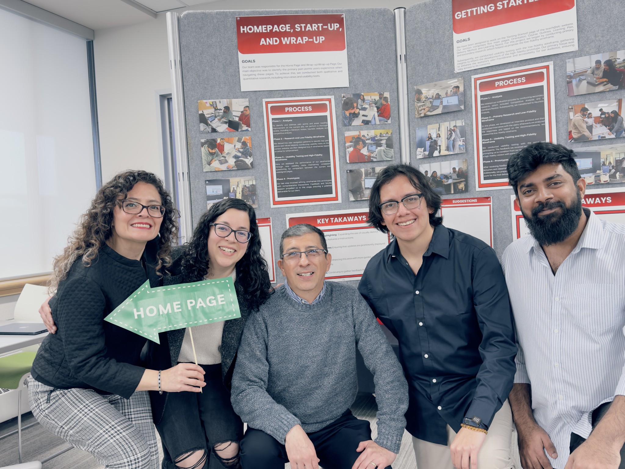
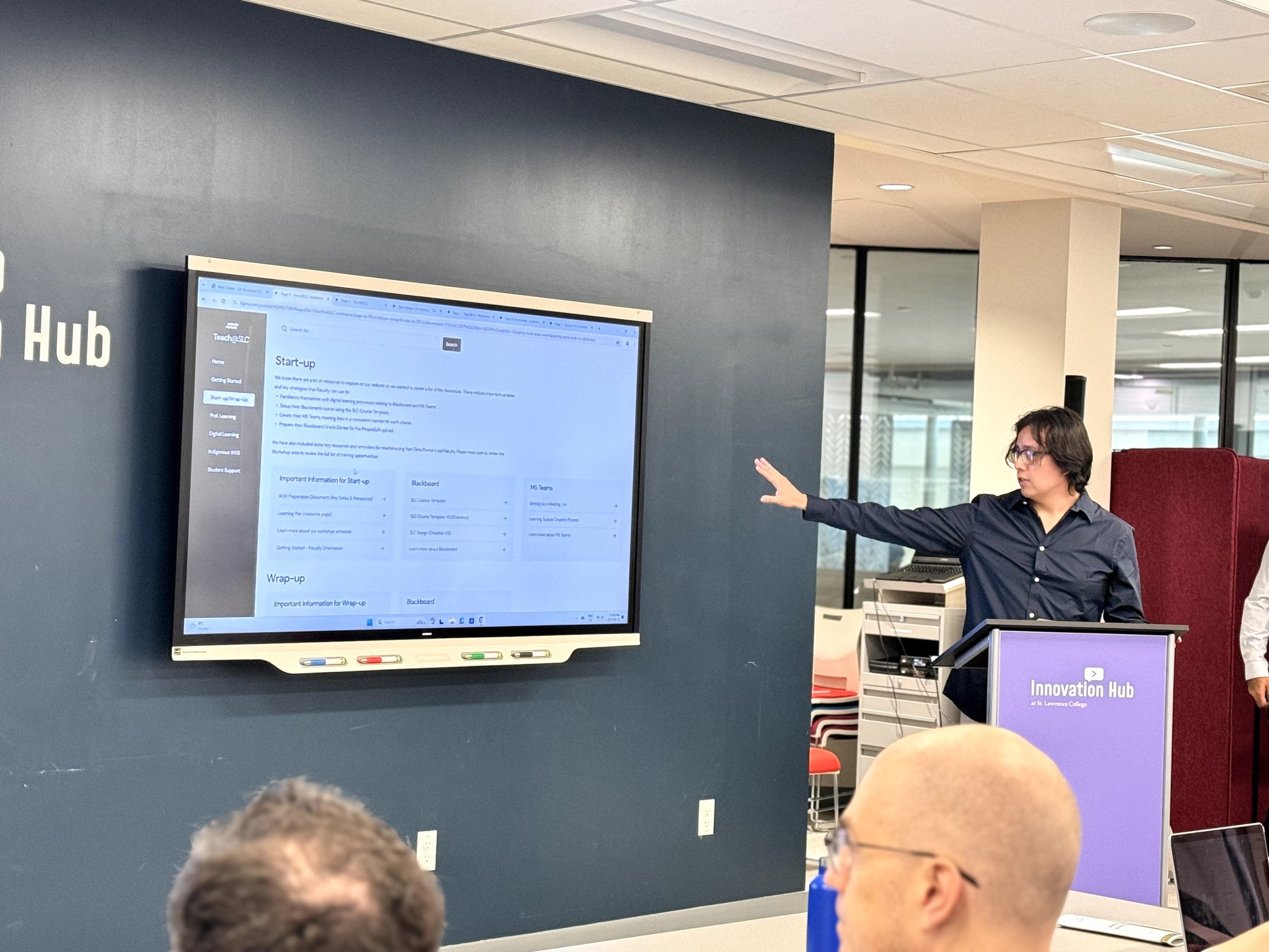
Rephrased left-menu titles for self-explanation, and improved each section's high-level descriptions to ensure clarity and understanding. And most importantly combined the wrap up/ start up pages into one to have a more condensed navigation.

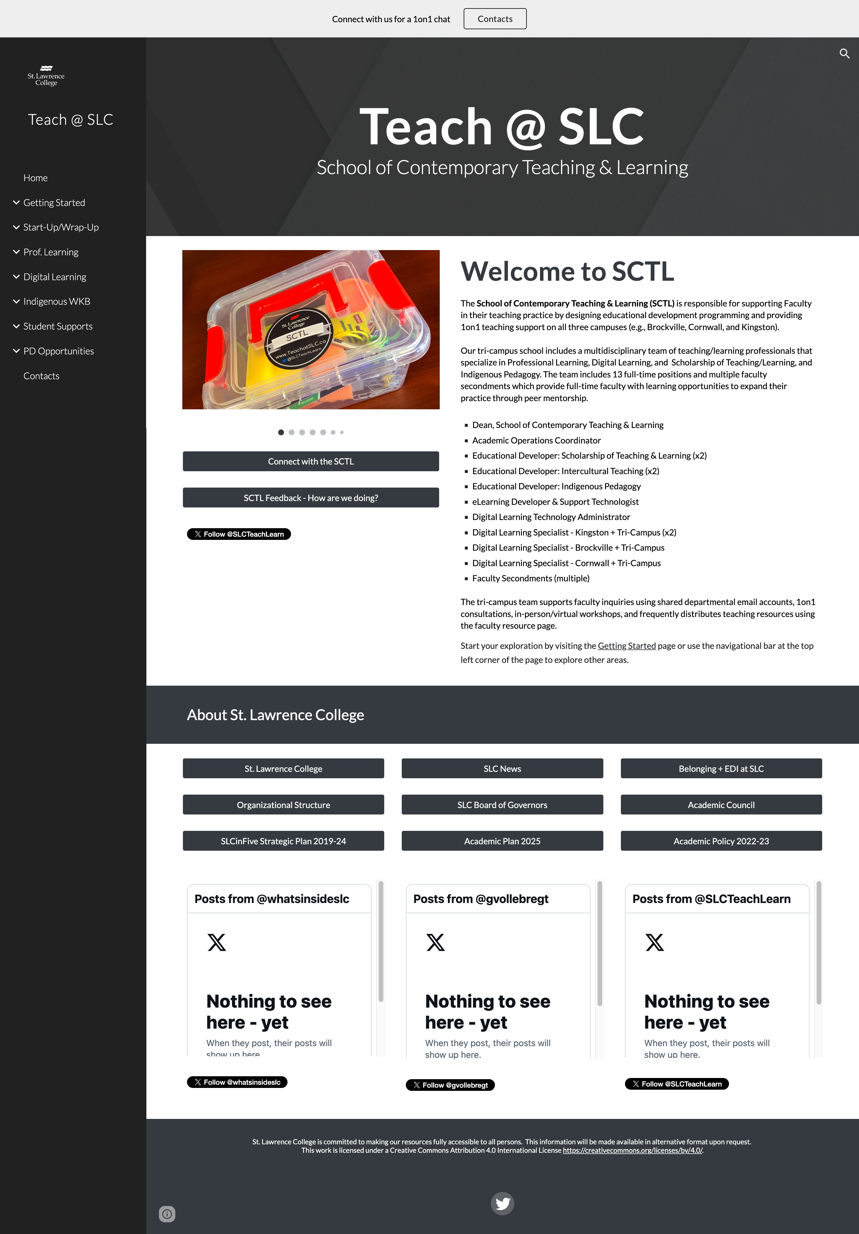
Faculty members talked about "useless information" on the homepage, this highlighted the need for a clean and uncluttered interface. We focused on essential elements like clear organization of the categories they use (like for example the wrap-up/start-up sections)

Phase 3

Final Wireframes

3 staff members for interviews and usability tests.

In Phase 3 of the project, we conducted usability tests and brief interviews on the Homepage and Start-up/Wrap-up pages, but this time using our new wireframes. We had a total of 3 participants (teachers) - 2 of them were returned participants, and 1 was a new participant.

Our wireframes maintain the same color palette, featuring black, grey, and white hues. Information is organized into chunks to enhance readability. The Start-up/Wrap-up sections are consolidated into a single page, streamlining access to information by reducing a step.

Client Presentation

We presented our findings to the Teach@SLC faculty members.

Our research highlighted key insights and recommendations aimed at improving the user experience for faculty members.

To sum up, the improvements proposed are not just about fixing what might be lacking; they are about building on what is already valued and appreciated to create an even more engaging, efficient, and user-friendly website. We not only acknowledge the original site's strengths but also demonstrate a commitment to continuous improvement and excellence in user experience.

This approach ensures that the website remains responsive to the needs of its users, thereby enhancing its value and effectiveness as a key resource for its audience.